Friday, 30 January 2015

Snoreeze

After we pitched our ideas to Snoreeze they were reviewed and four were chosen to be developed into the adverts that we will submit at the end of this brief. Initially I was placed into a group with Gemma however it was noticed that my style had been requested in the development of Celia's insect idea so I was placed into this group too along with Frances and Ankush. Initially I was meant to remain in both groups and Rosie was added into Gemma's group too to make sure she wasn't put under too much pressure. However it transpired that Rosie and Gemma worked well and myself Frances Celia and Ankush had a lot of changes to make to our idea which set back our schedule, because of this I was permanently moved into Celia's group.

After a lot of back and fourth between ourselves and Snoreeze it was decided that our idea development had taken the story and moved it too from its original proposal so we had to go back to the original storyboard and make only a few alterations that were specified in the email conversation. after this and a lot of prior conversation during which Snoreeze seemed to contradict themselves a lot or fail to understand us we were annoyed with this as it seemed to dismiss the work we had been doing and placed us back at the beginning, however it meant that we knew where we stood and exactly what we were doing, our tutors also said that they were no longer allowed to make big changes so we knew that we were now able to work on the final product. We decided that since my drawing style was no longer being used that I would colour the finished shots to give them a painted looked which Snoreeze had originally liked. In our pipeline it was decided Celia would be first generating the shots and making the key frames to establish the timing and movement of the shots, Frances would then make the in-betweens which create a smooth movement and tidy up the animation, I would then colour the shots, after I have coloured myself and Frances work together to render them and compose the final thing and add sounds. The first few shots to be completed worked in this order and the outcome was good, however the pace Slowed down this was because Frances had more work to do to make the in-betweens right as some of Celia's key frames had large gaps in the animation. I offered to help with the in-betweens but the drawings I produced were obviously different so would not have worked in the overall piece. This was not an issue though, over Christmas Frances completed the in-betweens for me and the colouring was finished before we began the second semester.


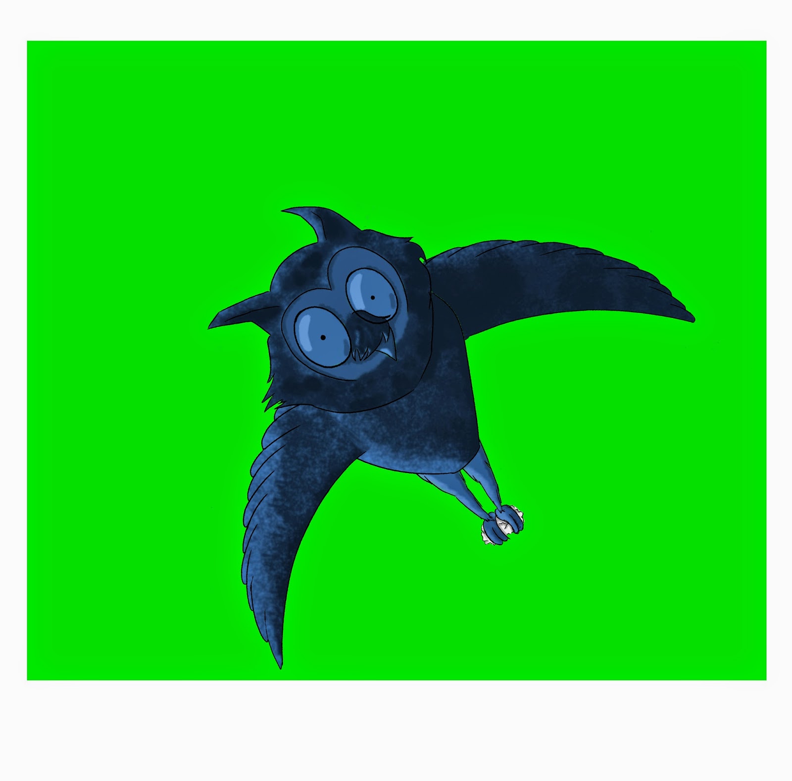
Before Christmas Dec was having some trouble with one of his pieces of work and needed a character colouring. I was asked if I could do this and as it was only one character I knew it wouldn't slow our group so agreed to help. The owl was coloured in no time and was a very different style to the one we were working in so was a welcome change.


We had a group presentation after the Christmas break to show how our adverts had progressed most of us were in the same position having completed the animation and just needing to find the sound. We had some small changes to make so the animation ran smoother and these were completed in time for a talk with Mario regarding our sound. Frances was originally scheduled to sort the sound but as she had already done a lot in the group and had sorted all the presentations I said I would do it. Finding the sounds was not difficult as we had been giving a disk containing many files to use, the hard part was searching them for the right ones. The sound most difficult to find was singing but in the end we found a file of reversed singing which we raised the pitch of. This worked well.
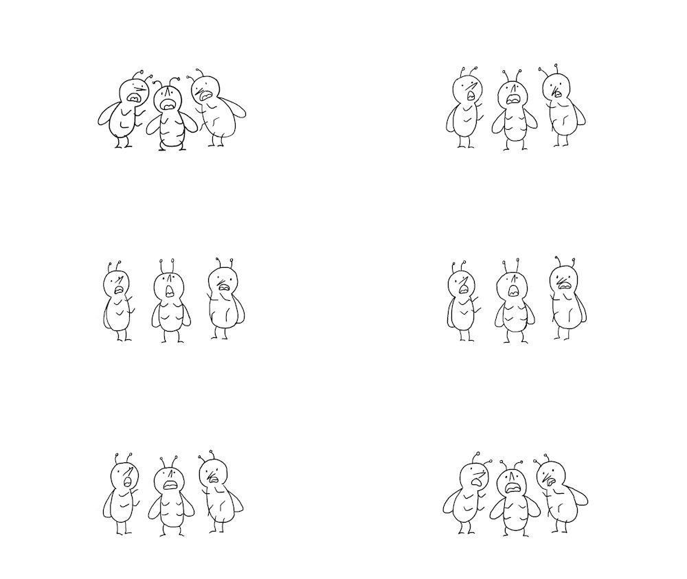
After adding the sound we had a meeting with Mario about it and discussed how it looked as we thought there were sections that needed altering. Mario agreed and we added the bugs to some shots where they had previously been absent and played the sound throughout. This gave the animation a much greater sense on continuity.

We finalised all this and presented our final advert to Sandra from Snoreeze, we found out they plan on us all having the same strap line at the end so this will need to be altered but other than that we had no changes to make so we were pleased with this outcome considering the changes we have had to make, Sandra also comented on this and said she was impressed how it turned out, i think she expected it to be worse because we started late due to sorting out changes that were requested.

Overall this project has been enjoyable, at times it was tedious and the client was hard to work with but i am happy with the final outcome. The group was really good to work with Celia's idea was great and how she was able to keep working and rolling with the changes that were requested as her idea developed away from its original only to end up back as it started helped stop me getting as frustrated as I might otherwise. Ankush worked on the 3D demonstration and this turned out great, he was good to work with he just got on with his work and got it completed. Frances worked very hard  taking the role as a director communicating with everyone and sorting us all out with schedules. She coped with the workload very well especially over Christmas when when she was also given extra as she had to do the key frames for shot 3 and 5 as well as in-betweens.

Friday, 12 December 2014

One second a week.

One second a week
first semester of the second year.
I have not completed one second for every week as my other work for the Snoreeze and RSA brief has taken priority.

I started this taking the imagery from an album cover, my plan was to animate each animal separately and finish of by putting them together to create the album cover moving. I will continue this into the second semester and try to finish it off then.


Whilst working on my woodland animal sculpt for Steve I was looking at psychedelic and "trippy" colour schemes and images. I focussed on contrasting colours together like yellow and purple or blue and orange. for this second I just did a basic animation drawing a spiral and making it spin.


For this second I was looking as slow motion videos, this lead me to notice how much movement goes into what normally looks like a simple action so I tried to capture this.
For this I decided to draw a guitars and try to show the energy in music without sound.


The lead up to Christmas has been ridiculously fast and it will be over before we are aware so I thought this would be a fitting animation to do for my second.

Sunday, 5 October 2014

snoreeze ideas

The aim of this weeks studies is to use our research from last week and come up with 3 ideas for an advert.
Idea 1
My first ideas follows on from the information given to us by Sandra during the presentation, she showed us some ideas using a sheep and a tank saying we could take inspiration from these and continue this idea if we wished. My idea is to use sheep as these are a commonly known representation of sleep, I plan on animating sheep jumping over a fence one after the other, after around 3 or 4 have jumped I will have the camera repeat the motion but have no sheep in the frame. once this has happened the camera can look to the other side of the fence where the sheep were jumping from to see a queue of sheep waiting to jump with the leader fast asleep. Once this has taken place snoreeze can be presented on the screen along with the statement saying "Get your 8 Hours" or something similar then the information regarding the product that needs to be displayed can be shown.
 This image shows the basic character sketches I created.             


This is an idea for the environment, I want it to be colourful and peaceful looking.


Idea 2 
This Idea is a little different to the cliché snoring advert using annoyed or tired couples and animal representations. For this idea I wanted it to be something visually different to the Snoreeze adverts my research found. I plan on setting this advert in an environment similar to a wind tunnel. Two people will be present in the tunnel talking about Snoreeze, they  list the benefits of Snoreeze, how it has natural organic ingredients, is the only product to guarantee 8 hours sleep, patented ingredients and formula. During this the wind will be blowing the two people back and forth ruffling their cloths and hair, when talking about how the product works the camera zooms out to show they are stood in the nasal cavity, as the product is used it can be seen working and then the wind in the tunnel gets stronger and the people are blown away.


This image shows the people being blown inside the nasal cavity.


this image shows a diagram of the nasal cavity and how the product travels through coating it to give snoring relief.


Idea 3
This idea takes inspiration form the European folklore the sandman. Rather than the sandman come to children and bring then pleasant dreams he comes to adults and stops them snoring, he sneaks into the rooms of people troubled with snoring bearing his umbrellas and after casting his sand in the air he applies the Snoreeze product. When he puts up his umbrella of good dreams the inside is filled with the pictures of the products and acts similar to zeotrope.


This image shows the sandman sitting by the bed with his umbrella having stopped the snoring with Snoreeze.


Sunday, 28 September 2014

snoreeze reasearch

Snoring: Snoring is the snorting or rattling noise that is sometimes produced during sleep. This noise is caused by the vibration of the soft palate and tissue in the mouth, throat and nose. Snoring can affect a person infrequently or regularly depending on the particular individual . Some people may snore occasionally making a noise that is not particularly loud or troublesome, whereas some people may snore every night loud enough to be heard from another room, which is more inconvenient.

It is advised you see a GP if your snoring affects your life such as excessive tiredness poor concentration or relationship problems, as these can increase risk in other areas of day to day life such as traffic accidents and problems at work

Snoring can also indicate a more serious condition called obstructive sleep apnoea which is when a persons airways become partially or totally blocked during sleep.


Snoring can have a number of factors that are the main cause of snoring these are, age, weight, alcohol, smoking, medication and pregnancy. Snoring can also be caused by viruses and allergies, this has an effect when the nasal passage becomes blocked due to a cold or allergy this restricts the airflow through the nose which forces breathing through the mouth. This in turn can lead to snoring.

Multifactorial snoring is also possible, this is because of both relaxed muscle tension in the back of the throat and nasal congestion.

Snoring products: There are many products available from snoreeze to help stop the different causes of snoring.
Product the throat spray targets the main cause of soring. its formula tones and lubricates the tissue at the back of the throat to provide effective relief and because it is time based it is proven to be effective for 8 hours. the spray contains natural ingredients and comes in a 23.5 ml bottle providing 50 applications.


ProductThe lozenges work just like the throat spray but are in the lozenge form. The lozenges have a mint taste which is refreshing and they disolve quickly for an imediate effect. The lozenges come in a pack of 16.

ProductThese oral strips are exactly the same as the lozenges but are stuck to the roof of the mouth rather that sucked. Packs of 14 and 28 are available.


ProductExactly like the other products. Shake the bottle before use, fill half the cap rinse mouth and gargle, do not swallow. The bottle will provide enough for 25 uses.


ProductSnoreeze nasal spray targets snoring caused by colds, alergies and nasal congestion. It has a unique blend of natural active ingredients that coat the nasal passage and open the airways providing effective relief from snoring for up to 8 hours. A bottle provides up to 25 applications.


ProductTargeting the same causes as the nasal spray these strips physically open up the airways to improve airflow and provide snoring relief. 20 strips in a pack, hypo allergenic and latex free.


ProductSnoreeze oral device is for sleep apnoea. Its adjustable design gently repositions the lower jaw forward to clear the obstructed upper airway and provide effective relief from sleep apnoea and snoring. Latex free.


Snoreeze adverts: apparently the least successful advertisements were the ones which featured live action people and the most successful were those that were animated and did not focus on couples but instead the positives of using the product.


http://www.youtube.com/watch?v=ir5KcojxVUo
This advertisement compares a bull seal, a fog horn and a man snoring and suggests that the snoring is the loudest, Snoreeze is then introduced and the snoring ceases, I think this is probably not effective as its is not a comparison people will make.

http://www.youtube.com/watch?v=02lmyoI-mO4
This advert has a woman sleeping in increasingly less likely places as her husband snores, I think an issue with this advert is that it focuses to heavily on the negatives and the positives of Snoreeze are only mentioned at the end with a brief glimpse of a happy couple.
Both these adverts are not very informative.

http://www.youtube.com/watch?v=gOZtqCd25Tw
A series of adverts were made in this style, they all began with a couple in bed the man snoring and the woman unable to sleep, the middle of the adverts differ slightly depending on the product advertised but Snoreeze is introduced and explained, a brief explanation of how the product is used and works is then shown before a list of its features. After this the happy couple is shown to display just how effective it is.


http://www.youtube.com/watch?v=KiyusWyoy1Y
These adverts have a very similar structure to the series above but are animated in a different style, personally I prefer this style because it is smoother, nicer to look at and has a nice simplicity.


There is also another advertisement which is drawn in this style it is a very simple design. During this advert a city scrolled past with lights turning on to the soundtrack of snoring. Snoreeze is then introduced and the snoring stops, it scrolls to an image of the product and an owl which then hoots, the narrator tells it to stop now its quiet for everyone to sleep. During the add the narrator also describes the product and its use. Unfortunately I cannot find an example of this advert but we were told that it was the most successful advertisement.


http://www.youtube.com/user/OldSpice/videos
Other advertisements that I like are the old spice commercials. These are memorable adverts, very daft but successful in getting the message across, I think one of the reasons they are successful is because they are easily recognised but are also amusing so are the kind of thing that will be shared amongst friends further spreading it.


http://www.youtube.com/watch?v=1gp7lpjh_uE
We were told that these adverts were similar to what snoreeze are wanting, they are animated in a simple style, do not focus too much on the negatives, showing the positive people after its use, and the tone of voice the narrator uses is calm and informative.


http://www.youtube.com/watch?v=enCgNWoDAOU
I really like this advert. I think it is really well executed and is in a very arty style as opposed to the more normal looking styles in the animations above, it is fairly long for an advert but does not feel it to watch. It mentions a lot of situations most of which people will be able to relate to so I think this will increase its effectiveness and is for a good cause so will impact on peoples morals making them more likely to remember it and take part.


http://www.youtube.com/watch?v=F_-9QFvhQWo
This advert is memorable because of its annoying mascot, this is not really suitable for snoreeze as this advertisement is about remembering a name when you need it rather than making you actively get up and look for it. Also Snoreeze did mention the fact that most countries do not like the idea of a mascot and the advert needs to be able to be used around the world so I'm not sure if this approach would be a good one.

nocturnal animals: These are animals that I think could be used in the animation as a reference to night time and sleepless nights. Snoreeze have mentioned that they have some designs with a sheep which we may work with if we like.
Badger,  Cat,  Fox,  Hedgehog,  Mouse,  Owl,  Rabbit,
I have chosen these animals because in most peoples eyes they are a good representation of night time, they are also regarded as cute and fluffy so most people will like these animals and feel drawn towards them.

Other Representations of Sleep:  Sheep are a common representation of sleep, counting sheep as a symbol of sleeplessness and trying to sleep.

The Sandman is another fictional character associated with sleep. In Northern European traditional folklore the Sandman would travel around bringing good dreams and sleep to children. He would throw some dust into the eyes of children enough to keep their eyes closed, then blow on the backs of their head and neck to bring on drowsiness but he did not mean harm he then gives good children pleasant dreams and naughty child no dreams so they have a heavy sleep.

Target Audience: the suffering partner, 85% female, married or in a long term relationship. aged 45-65 years, Passion Point: relationships, socialising, worrying about her husband.
Attitude to Snoring: Desperate, sick and tierd of poking her husband, guilty about feeling so frustrated, uneasy about asking her husband to take something.


Thursday, 28 November 2013

Steve Dee model making project

To begin this project we were shown a piece of work that Steve had built the models for. We were then given our brief to create a similar piece using house hold products. After discussion with Kate we came up with the idea of building a piece that was a hero and villain fight scene, for the hero Kate decided to use a bottle of washing liquid cut down with the idea of a small but mighty character. For my character I had the idea of using cans because I had a large amount of these and they stack so I would be able to create a large chracter out of the many smaller ones. The character designs I began with started very basic with little change being made to the can. I then began to develop this idea with a suggestion from Kate to cut and unfold the can and slice this to give the character more movement and the addition of legs. I then researched bacteria because this is what I am basing my character on, there were many different images and types of bacteria but they all had characteristics in common which were hair like structures around the cell with longer flagella on the bottom, they all had a loose chromosome plasmid and ribosome's. My next development in the design of my character was to incorporate these characteristics to my cans, I experimented with different ways of  opening up the can to expose the inside.

 I thought the best way to do this was the second image because it offers more movement with each strip being able to be moved separately. I next worked on ways of making the cans more resemble bacteria by adding more detail inside the can.
This image shows these additions hanging inside the can, I chose to keep these details 3 dimensional rather than drawn to give it more depth. I decided to move away from this though because it just didnt fit how me and Kate were imagining the piece, we both envisioned the pieces being quite insect like living together in a hole and coming together at the end to for one creature, for this I decided a can like the ones above on its side would be better so it could scuttle.

My focus now was on colour, I wanted to characters to appear to be mucky, villainous and be able to be linked to bacteria,  one way to do this would be to colour the cans using paint. Another idea I had was to collage with parts of cans so various logos and colours would be present within each piece, I like this idea because it changes the texture of the cans and also the different colours help to represent the frantic movement and feeling I wanted to create in these characters.
This is the beginning of the collaged  piece, I made this with super glue witch I found wasn't as affective as I had hoped, it did not hold the piece together well and took a long time to bond the metal together which when sticking many pieces like this to create one character is not useful. A good thing with super glue is that it also sticks me to the cans and the piece is left with many fingerprints and dried patches witch added texture and helped to elaborate on the mucky way I wanted to portray the character. After adding wire to the bottom for legs the character was finished. 
during filming after we had completed all the scenes with the smaller singular bacteria  had to attach them all together to create a larger monster to try and defeat the knight. this character was just all the bacteria already created overlapped at the ends to make a long centipede like character


The story for a piece had a few minor changes throughout as we developed our work, we began initially with  rough idea wanting to base it on a knight and monster type story, we developed this a little but had to make a slight change to compensate for the addition of another character, however this character was not created so we story boarded again without this character, this was not a problem though a re story boarding helped us to develop the story and rethink aspects of it. 

When it came to actually animating the piece it began as a rough process, my models had been thrown away by a flatmate so I had to quickly rebuild them luckily they are not complicated pieces to build so this was not as big an issue as it could have been, after this we built the set, this was a cave built out of a plastic bag with wire in the top to open it like a mouth  we used some hair rollers fashioned into trees, this was a good set it did what we needed it too


Friday, 22 November 2013

one second a week, wish you were here

As this week contains Halloween my first thoughts for were based around this, however I was not sure what to actually animate for this and was struggling to find inspiration for my work. For my Halloween costume I purchased a large pumpkin which I hollowed out carved and wore on my head. it was not until after this was done and I again mentioned to my flat mates my difficulties in creating an idea that someone suggested to me that I should have photographed the process of me carving the pumpkin, I really like this idea  but it came too late so I cannot do this, however i may buy a pumpkin now they are cheap and then do this and use the flesh after to make food so it is a win win situation. This week I have also been getting my flatmates into Pink Floyd and Gerald Scarfe who had a massive influence on my work last year. This resulted in us watching a documentary about the making of the album "wish you were here". It was from listening to this music watching the videos created by Scarfe that made me decide to take my inspiration from the iconic album art of the wish you were here album. The two men shaking hands whilst one is on fire is where I began, I planned at first to have the flames leap up from the ground leaving behind the man. This left the problem of introducing the other man, one idea was to have the flames create both men but only one is on fire on the artwork so i was not happy about this. the second idea was to have the man walk in but in just a second to make him come in and shake hands seemed a bit fast so I decided to have the image as a still and have the fire on the one man whip around him as it burned. This is the idea that I decided to use and began by drawing out the image of the two men for the first layer. I used photoshop to create this animation because it allows me to use colour relatively quickly and is a program I am still getting to grips with so am enjoying using. I next created the fire on separate layers and created a new layer for each frame of the piece so I could easily put it into timeline and animate it.

Monday, 21 October 2013

photography project


The aim of this project is to portray certain emotions and express film genres using raw unedited photographs. The themes were Happy, Sad, Tense, Curious, Busy, Calm and Quiet, A Storm Approaching, Autumn, Film Noir, Comedy, Pulp Fiction, Action and Horror. We had a short tutorial about creating depth of field and different camera settings to make areas of the photograph in the fore and background appear out of focus and the subject of the photograph remain in focus and then we hired a camera and began. As it was the first day we were all new to the brief and still generating ideas so myself and Dec decided to walk into town and just take photographs as opportunities presented themselves rather than trying to create scenes. When I returned to my flat I had some of my flatmates pose and act whilst I photographed them this photos are obviously posed for rather than natural but express the emotions well so I kept them, I then spent the rest of the night getting accustomed to the camera and focusing on different subjects for practice. I convinced a flatmate to come to Blackpool on Wednesday because I thought this could present me with opportunities to get plenty of different themes, the weather wasn't good so this was good for the storm approaching. For these photographs I turned the exposure down to darken the photos making them almost black and white with just hints of colour in it, these photographs look like they have been edited but this is because of how the weather and lighting was on the day, many of the photos from this day portray a storm approaching the two best in my opinion were photos of the pier with a very choppy sea and darkened sky around it and rain drops on the window of the train on the journey home.

For happy Ii decided to use a photograph that I took of an unsuspecting flatmate as he spoke with his girlfriend, I decided to use this because he didn't know I was taking the photo so it is a natural pose.
For sad I used a photograph of a memorial with poppy wreaths on it as I feel death really sums up sadness.
For tension I took a photograph of Laura playing on a grabbing machine because this is tense in the sense that she does not know whether she will be successful or not and it is also tense because the teddy is hanging from the machine.
For curious I had Laura look over the barriers and gaze into the distance this I feel shows curiosity as she wonders what lies before her hidden by the stormy surface of the water.
For busy I photographed jenny working at her desk surrounded by here laptop and papers, I also took photos of crowded streets and people preparing meals but I felt this picture best described busyness.
For calm and quiet I went to the library with Dec as this is a quiet learning area with little commotion and provided a perfect setting for this theme.
For Autumn I used fallen leaves as my subject.
Black and white photographs seemed to be the best way I could interpret film noir using the old pier arch and seating as my subject.
For comedy I decided to use the classic banana skin with someone walking towards it as I thought most people will easily make this connection between it and the comedy theme.
for pulp fiction I took a photos of my flatmates smoking outside looking serious with a darkened exposure looking very much like they were from a film or novel.
For action I decided to have my flatmates perform various tasks like handstands and cartwheels, I wanted to photograph Cam and Jenny doing a handstand and cartwheel simultaneously but Can went too early, however I like this because now it looks like Jenny is being chased by Cam on his hands and it captures the action pretty well.
The final theme was horror and for this waited until it was very late and climbed over and under to an old railway bridge near my accommodation, I then photographed the two tall archways where the lines would have run because of the darkness of the photo it is very difficult to make out the subject adding to the horror theme where you do not know what lies ahead